
If you’re in the medical industry, you already know how critical temperature monitoring is – and how frustrating it can be to dig through data when something goes wrong.
Most users rely on the min/max report to get a quick snapshot of their logger’s performance. It’s simple, fast, and usually all you need. But here’s the catch: the moment you spot a temperature breach, you’re forced to go back into the system to figure out what happened. When did it occur? How long did it last? Was it a one-off spike or a sustained issue?
On the other end of the spectrum, there’s the all readings report – a complete log of every recorded temperature. It’s thorough, yes, but also overwhelming. You’re looking at pages and pages of data, most of which are perfectly fine. It’s like searching for a needle in a haystack.
So what’s the sweet spot?
The min/max + extremes report gives you the best of both worlds:
When everything’s fine: You get a clean, concise summary – just the min and max readings, with no clutter.
When something goes wrong: The report automatically includes the exact readings that triggered the breach. You see the time, temperature, and duration of the issue, without having to dig.
It’s smart, efficient, and designed for real-world use – especially in environments where compliance and quick decision-making matter.
Here is a section of a weekly Min Max With Extremes report showing the result of a brief power outage.
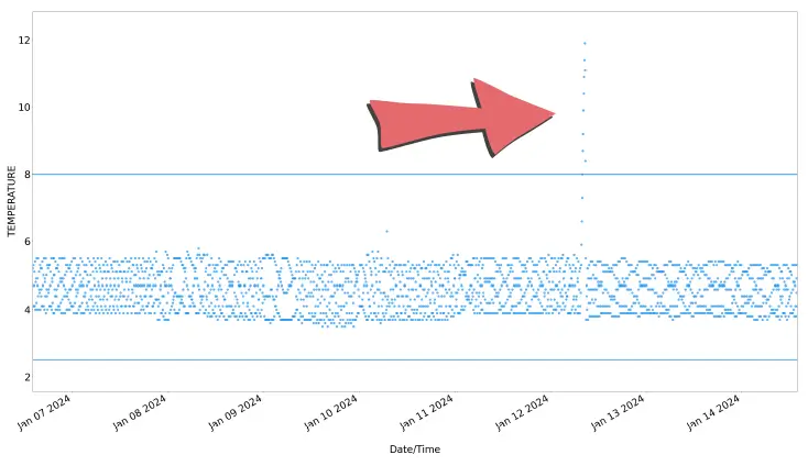
When we look at the data table part of the report for that week, we can see the weekly summary fits on one page, but tells us all we need to know about the breach.
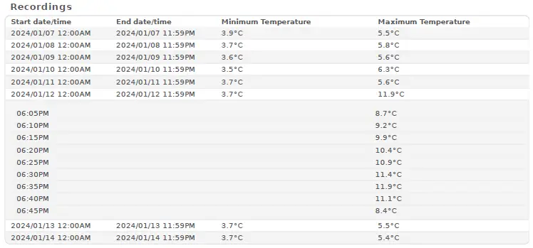
On the days where no out-of-range data was recorded, we see the simple minimum and maximum.
But on the day of the breach, we see all the temperatures that were above the threshold.
We can see at a glance how long the breach lasted and what the maximum temperature was.

The National Association of Testing Authorities (NATA) is the recognised national accreditation authority for analytical laboratories and testing service providers in Australia. It is an independent, not-for-profit organisation that provides independent assurance of technical competence.
NATA accredits organisations to perform testing and inspection activities for their products and services. This gives consumers the assurance they need to make safe, healthy and reliable choices .
In the top right corner of the Location page, you will find the View chooser.
There are three options: Simple, Detailed and Gauge.
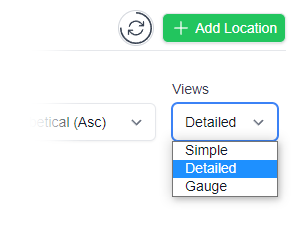

Simple View
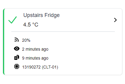
Detailed View
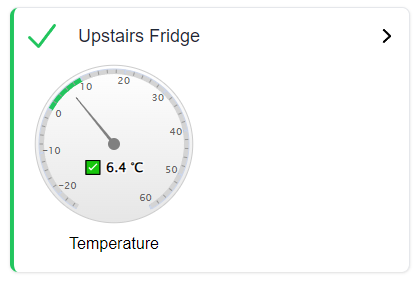
Gauge View
| QUICK SPECS | |
|---|---|
| Model | CLD-01 |
| Type | Temperature only with Dual Sensors |
| Temperature Range | Internal sensor: -23°C to +60°C External sensor: -40°C to +80°C |
| Humidity Range | N/A |
| Battery Type | CR2450 |
| Battery Life | Replace every 12 months |
| Accuracy |
Internal Sensor: ±0.3℃ (0℃ to +60℃) ±0.3℃ to ±0.7℃ (other temperatures) External Probe: ±0.5℃ (-20℃ to +40℃) ±1℃ (other temperatures) |
| Offline Memory | approx 24 days logging at 5 minute intervals |
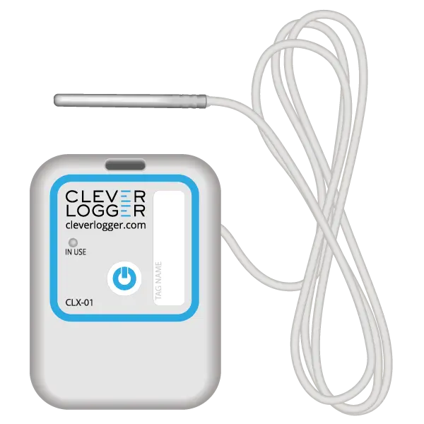
| QUICK SPECS | |
|---|---|
| Model | CLX-01 |
| Type | Temperature only with Probe |
| Temperature Range | -40°C to 60°C Can operate up to 80°C for short periods |
| Humidity Range | N/A |
| Battery Type | CR2450 |
| Battery Life | Replace every 12 months |
| Accuracy | ±0.5℃ (-20℃ to +40℃) ±1℃ (other temperatures) |
| Offline Memory | approx 24 days logging at 5 minute intervals |
To prove it, we’ll send you a Starter Kit to try out for a whole month.
Set it up, have a play, explore the features – obligation free.
If you love it, just let us know.
If not, just send it back.