Easy to use temperature data logger - logo

Viewing your data as a graph

SEE ALL TOPICS
CLOSE
The Guide logo
Your Account

ON THIS PAGE

graph showing temperatures during power failure
Viewing your data a graph makes it easy to spot anomalies - like this temperature spike caused by a power failure

Choose a location to view

Click on Locations in the dashboard menu

Opening the Locations page will show you a list of your locations.

There are various ways to view the locations on this page – read more about this.

Click on the Location you wish to view. By default, this will open in the Graph view.

list-of-locations

Zooming in and out on the data

Click and drag to zoom in

Place your cursor just before the area of the graph you want to enlarge and click and hold the mouse button. Drag the mouse to the right. A section of the graph will be highlighted. Release the mouse button when you have highlighted the required graph section.

Click the Reset Zoom button to zoom out
zoom on graph
Click to enlarge

Navigating the graph

1. Common date presets

Common date ranges at your fingertips

By default, the graph will show you the last seven days of data, but it is quick and easy to show a different set of data.


You can quickly choose from common date ranges

2. Specific date and time range

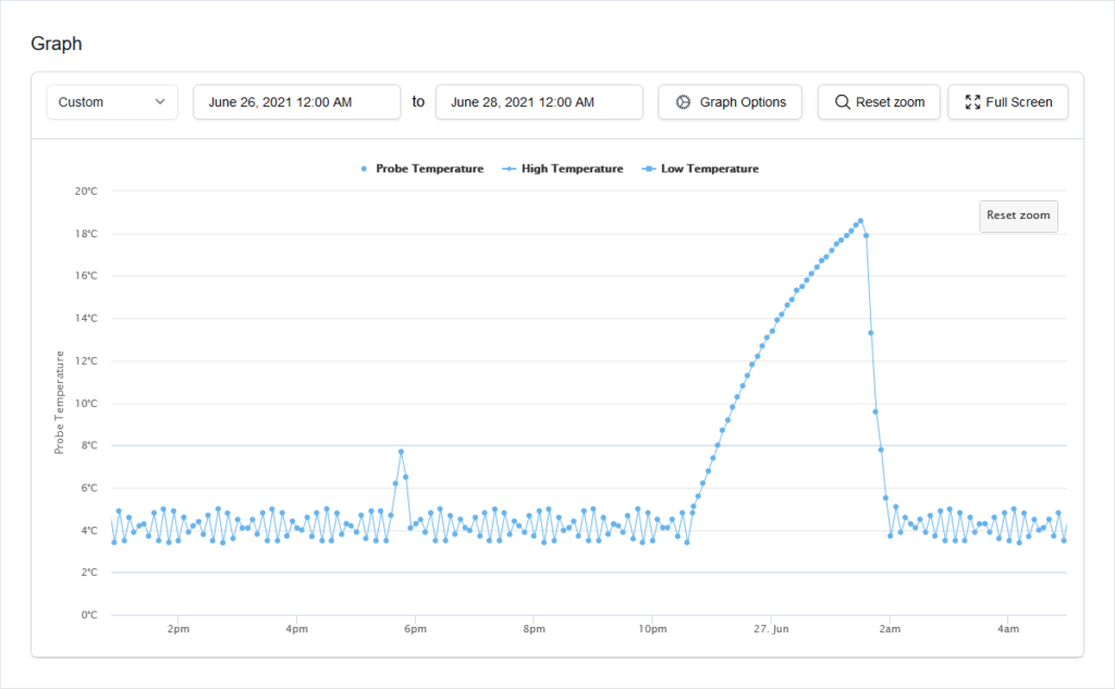
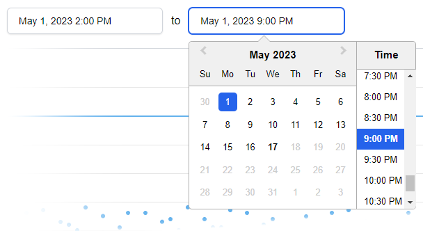
If you need to get down to the nitty-gritty, you can set the graph to show a specific range down to the nearest 30 minutes.

Click on the left hand date picker to choose the start date and time. Then click on the right hand box to pick the end date and time. In the example above, we have chosen to show data from the seven hours between 2pm and 9pm on May 1st.

3. Graph options

Features

Switch different data displays off and on.

Date Range

This has the same functionality as the Date Range pickers described in point 2 above.

Timezone

View data as if you were in a different timezone.

4. Reset zoom button

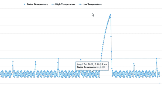
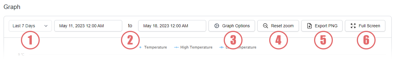
It’s possible to zoom in on specific parts of the graph – more about that below.

The Reset Zoom button zooms you back out to show the full selected date range.

5. Export PNG button

PNG (pronounced “ping”) is an image format that is ideal for showing graphs.

Clicking the Export PNG button will let you save a picture of the current graph as a picture on your computer. You can then print it, email it or add it to a report.

6. Full screen mode

This feature display the graph in a full screen window, making it easier to see on smaller screens.

All of the features above are still available in this mode.

To exit full screen mode, click on the Exit button in the top left corner.

30-DAY FREE TRIAL

You're going to love Clever Logger

To prove it, we’ll send you a Starter Kit to try out for a whole month.

Set it up, have a play, explore the features – obligation free.

If you love it, just let us know.

If not, just send it back.

What is NATA?

The National Association of Testing Authorities (NATA) is the recognised national accreditation authority for analytical laboratories and testing service providers in Australia. It is an independent, not-for-profit organisation that provides independent assurance of technical competence. 

NATA accredits organisations to perform testing and inspection activities for their products and services. This gives consumers the assurance they need to make safe, healthy and reliable choices .

Location Views

In the top right corner of the Location page, you will find the View chooser.

There are three options: Simple, Detailed and Gauge.

change-location-view

Other "How To" articles

Frequently Asked Questions